Friday, 4 November 2016

Exhibition Visit, OCA Study Weekend. Brighton Biennial; Beyond Bias- Reshaping the Image

I had the great pleasure of attending the OCA Study Visit at the Brighton Biennial over the weekend of 15th - 16th October.  I found it a whirlwind of a weekend, intense, stimulating and full on with lots of fascinating discussions; by 2.30 on Sunday I was exhibitioned out.  The title of the Biennial was Beyond the Bias - Reshaping the Image and it focused on identity and image as influenced by the  photography.  The brochure informs us that the festival explored photography's role in defining and informing our understanding of subjects such as:gender and sexuality, the representation of the body, the politics of style, subcultures and the subversion of social and cultural norms.

Reimagine, University of Brighton Galleries.
This was a joint exhibition by British photographer Olivia Arthur and Indian photographer Bharat Sikka.  They have collaborated to work with the LGBTQ+ communities in Mumbai and Brighton to explore the presentation of self-image in relation to the body, gender, sexuality and fantasy.  Unfortunately we were not allowed to photograph in this gallery, but before we began Jesse asked us to consider it from three stand points:-

  • how the images explore stereotypes
  • how the differences and similarities of the two practitioners shape our view
  • to consider the framing, hanging and curation of the images.
Olivia Arthur's work was in black and white.  They were a mix of very large prints in wood frames with no mount, with smaller images printed on aluminium. The framed images were in vertical format, whilst the dibonded prints were horizontal. Some were stuck directly onto the wall.  Bharat Sikka's images were large colour prints mounted on either PVC or aluminium  Captions gave very little information (just name and place) and gave no clue as to gender or sexuality leaving the viewer to make up their own mind or to ask questions of the images.  If we didn't know the context in many cases would we actually know that the sex/gender of these people were not as they appeared or in the case of couples would we know in some cases that they were not heterosexual couples.  I wondered whether they should be classified as portraits or documentary images, but then again there is a blurring of genres today and they could be both or neither.  My impressions were that these were people who were happy with their own sexuality, although, in the case of Bharat's images one or two of the subjects gave the appearance of being ill: Tony and Kelly.

I suppose if I am honest, although I have no experience of Mumbai, these images did fit with what we are told to expect of Brighton.  I had not visited before, though, and I have to say I found it a fascinating and vibrant city.

I thought that the exhibition was well curated and the pictures well-presented and hung.  Having the work of the two photographers separated worked; it might have been confusing to mix the colour and black and white.  I approved of the captioning as it allowed us to form our own opinions and to ask questions of the images.  I thought that the text slide show was a good idea.  It was interesting and added something and didn't detract from the show, providing, of course, that we looked at the images first.

Fashion Shows
This exhibition, created as a 'cabinet of curiosities' by British photographer Nigel Shafran.  The show comprised imagery from a range of eras and it was fascinating trying to age them.  On display were model cards and vintage beauty treatment manuals.  The agency advertising model cards showed a large number of pouting and smouldering looks and flyaway hair - what we expect of models.  These were stuck directly to the wall with no gaps between.  The models have all adopted a certain way of looking.  The wall-papering table for the paper folds was an intriguingly low tech display.

The Dandy Lion Project - University of Brighton Galleries, Edward Street.
This exhibition displayed over 150 images by more than 30 photographers.  It explored the Black Dandy phenomenon.  It highlights young black men in cityscapes, defying stereotypes of black male identity by a fusion of their Edwardian-era clothing with traditional black African flamboyance.  I was reminded of the way African tribal men get done up in all their finery for special occasions such as the Gerewol ceremony of the Wodaabe tribe in Saharan Niger who dress up to display in front young unmarried girls to try to win wives.

The images in the exhibition were largely in colour and mounted either on PVC or aluminium or straight onto the wall in vinyl strips like fellow student Stan Dickinson's in his SYP exhibition in Sheffield.  Some of the young men could have been models posing for a fashion magazine, others were more natural. Upstairs there was a mix of colour and black and white mounted on foam board (?) I felt that there was a great deal of humour in this show.  All of the subjects seemed to be really enjoying what they were doing - this is my identity and I am proud of it.  They all appeared super confident and the images suggested a positive outlook.


Brett Rogers - Desert Island Photos
I really enjoyed this interesting take on the BBC's Desert Island Discs.  It was just a pity that I found it hard to hear.  At the beginning we were all asked if we could hear, but then the speakers seemed to drop their voices as they were having a conversation with each other. Also they were sitting down at our level.  It would have been so much better had they been using microphones and on a raised platform.  This only slightly took away from the enjoyment, though.  Perhaps I should have taken my hearing aid. ;-)

Brett Rogers is Director of the Photographers Gallery in London and was being interviewed by Stephen Bull, course leader for photography at Brighton University.  She had chosen 8 photographs about which she spoke.  She said that all of the images had a personal or professional meaning to her.  Her selection of photographers was:-

  • Far Godwin
Rogers has always admired Fay Godwin who came to photography late in life and was a personal friend.  She brought literature and poetry together with photography.  The only woman working in landscape at that time, she was determined to bring her own voice to the subject.  The image shown was taken at Pett Levels where she lived and where Rogers knew well.  She was in the Robert Adams tradition of campaigning photography.

  • Madame Yevonde
She was an early pioneer of colour, a feminist and suffragette.  She examined the role of women in society.  She was radical in composition and lighting.

  • Max Dupain
The image chosen from the work of  this Australian photographer  was the black and white The Sunbaker .  It is a poster from 1975 and is reminiscent of a Henry Moore sculpture.  It was suggested that the beach represents the space between nature and culture.

  • Dianne Arbus
Brett Rogers showed a typical Dianne Arbus image of a disabled boy in a park.  She felt that it sums up Arbus's work.  Rogers feels that her work is something of a self-portrat and she could have chosen any of her images.

  • David Goldblatt
The image chosen from the work of South African photographer David Goldblatt, known for his portrayal of South Africa during apartheid is one of white boy with his black nursemaid, The Father's Child with his Nursemaid. Rogers was interested in the power relationship in the image where the boy stands behind the seated figure of his nursemaid with his hands on her shoulders.  She finds the relationship unsettling.


  • Karen Simmons
This is a colour photograph, reminiscent of a Dutch still-life of contraband food at JFK airport from a series America, Uncanny and Unfamiliar.

  • Sally Mann
This is an image of her daughter smoking a (a fake) cigarette looking older than her years.  Her sister is beside her with back to the camera as is her brother further back on a pair of stilts.  This from a controversial series on her children which had Mann banned from the UK and the Photographers Gallery nearly shut down for displaying the work..  Although unsettling, Rogers feels that it is fantastic work and should be shown.  The suggestion is that the younger children are looking back to childhood while the girl of the main subject looks forward to adulthood.  This is a performance photograph with the children acting for the camera.

  • Anonymous
The final photograph is by an unknown photographer and was acquired from a fleamarket.  It is of cross-dressing army personnel in a POW camp.

When asked which ONE image she would keep to take to her desert island Rogers was unequivocal in answering Fay Godwin as there were so many personal memories.
Fabrica - Kick Over the Statues.  Ewan Spencer
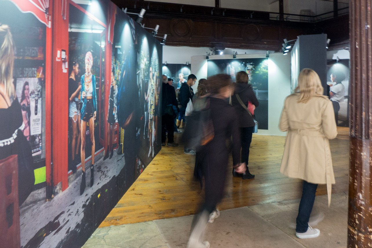
This show by Ewan Spencer, who graduated from the University of Brighton in 1997, was in the interesting space of a disused church in the centre of Brighton's Lanes.  It is a celebration of youth and music culture in the UK and from around the world.  His work is used in both the magazine and music industries and has been published in books.  The images in this exhibition were taken along the route of the Notting Hill Carnival and in Liverpool.  Instead of a gallery display of images this installation recreates the way in which photography is often encountered in a modern city with large format images posted onto custom built billboards.  There is also a video and music presentation.  Lighting is designed to look like streetlights.  The viewer is directed round a route through the billboards in the way we might walk through narrow streets.  I thought it worked well, although fellow students suggested I was showing my age when I had soon had enough of the music (?).  The way the work was presented reminded me of the way Paul Gaffney had displays his images of walking and was something I have in mind when it comes to exhibiting my own work.




The Regency House.
We had a fairish walk in the rain to reach this location, but it was worth it for the location alone; I could have brought the doors home with me.  There were three separate exhibitions here; two on the ground floor and one upstairs.

  • DIY Dreams, Tom Heatley.
This exhibition explored the theme of home improvement by using a series of photographic installations and sculptures.  This celebrated something that we all do in our own homes and it showed great attention to detail.  It was very quirky and imaginative. and demonstrated yet another way to display photographic work.


  • Architecture is the Art for the Ages, David Sterry
David Sterry is an architect as well as a photographer and this body of work is about buildings, their massing, the streets they are in and the spaces in between.  These were very large rich black and white prints in white box frames with floating mounts; yet another way of displaying work.  These images appealed to me.

  • Selected Works, Sam Laughlin
The main body of this work - slow time - is a reflection on natural forms: flora, fauna, landscapes and the quiet processes that happen within them.  Sam says that the work is an attempt to reach an understanding, which though informed by ideas from geology and ecology, is open to interpretation.  He says that the title denotes both the nature of the subject and his approach to it: processes which take place slowly, and a slow way of looking at them.  Alongside this series was another - nests - which is a study of animal architecture and in this Sam collaborated with ecologist Prof. Nick Davies.

The black and white images were stuck straight onto the wall.  I was intrigued by this work with it's depiction of natural forms.  Sam says that he used basic film techniques and old equipment, one lens even having mould growing in it.  He bought all of the boards and lighting and installed and curated the work himself.  The one aspect I was not so sure about was that he had gone for a low contrast approach.

The nest images were all of the same species (reed warbler I suspect?) and all the same basic structure, yet all different in a similar way to Bernd and Hilla Becher's work.

My main reflection is that there was an awful lot to take in here and I wonder if it would have been more punchy with less work.  Sometimes less is more.


Day 2
Day 2 began with a group crit. which I have written about elsewhere.  After lunch we moved onto an exhibition in the Photofringe at the Phoenix Gallery where we saw the work of Dana Ariel.
Encountering Perforated Ground, Dana Ariel
This is a series of landscapes taken in Israel and Palestine that have been hand printed by Ariel herself.  There was a mix of formats, some having white frames and printed on semigloss.  These had a white border, but were not mounted.  The frames were shallow box frames.  Two very large vertical format images were printed on a very thin paper or tissue and hung simply from pins/magnets.  There was one very large panorama that had been printed on either aluminium or PVC.  There were no captions to these images which allows the viewer to form their own opinion and ideas as to the narrative, but there was also a slide show of text for the viewer to gain more information should they choose.  Most images were in colour, but there were one or two in black and white.

Ariel says that they were taken between 2014 -2016 and tell a story of political erasure and displacement.  She had repeatedly visited two villages on the border between Israel and Jordan and, although the villages do not appear in the photographs, the images are of the journey to get there.  I was struck that like my work they featured paths and tracks.  The land here is of edgelands, perforated ground and disputed territory.


Also featured in this exhibition was a book, Hannich Forest (erased), which I felt had particular reference to my work.   This 2016 book of etchings contains 17 prints which record the erasure process of a copper plate.  The book begins with an etching of a forest path disappearing into the distance like many of my current images.  On succeeding pages the image becomes first successively darker until almost totally black and then lighter again.  My expectation was that we would finish with the original image but, no, just a blank page, which left much open to conjecture.  I looked at this book with Clive soon after he had commented on my prints that I had taken for the crit.  We both commented on the similarity with my work and Clive suggested that I experiment with recreating the effect with one of my own images, even if just for my blog.


An excellent, stimulating, if tiring, weekend.  I had much to ponder on on the train journey home.

Thursday, 3 November 2016

Exhibition Visit, Sheffield. Part of the Off the Shelf Festival of Words

As part of this exhibition three OCA students and colleagues from my peer-led hangout group featured bodies of work related to personal memory.

'Look for Him' and 'What Remains'.
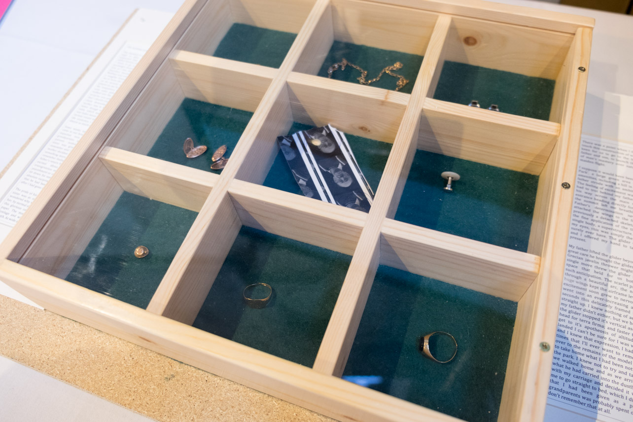
John Umney's work (Look for Him) explores his tortured relationship with his father using memory, photography as metaphor, text and his father's personal artefacts, whilst Stephanie d'Hubert's (What Remains) is a reflection on the lives of her parents featuring a book of photographs, both from the family archive and also her own images of artefacts along with text as well as treasured family memorabilia.

The work of both artists is displayed in a side chapel of Sheffield Cathedral and the work faces the viewer as they enter the chapel.  It is displayed on two adjacent tables covered with white cloths. This, along with the quiet, calm atmosphere of the chapel, makes them reminiscent of altars.  The exhibition is an installation rather than images in a gallery and features artefacts, book and video presentation.


Although both works are based on memory, they are contrasting memories; John's quite anguished and tortured as he tries to come to terms with his relationship with his father and Stephanie's happier ones, although still tinged with sadness, as she remembers her mother and father.  When I was there the organ was being played and this added to the atmosphere and I felt that the whole thing worked well in the austere, minimalist surroundings.  I wondered whether the displays might have been more effective had they been placed in the adjacent arches in order to frame them, but on reflection they were better positioned as they were as the arches were on a side wall and so they would not have faced the viewer as they entered the chapel.

Both projects are emotive and very powerful and in each case the addition of the artefacts increases that effect as they give a 'reality' to the whole. I thought that both displays  worked well and I particularly liked the way Stephanie had displayed her mother's rings and, yes, the lavender still had a strong scent to it.  Although I was familiar with John's work, having seen it develop over the last 18 months, I had never seen the artefacts.  John had beautifully crafted a wooden box to display these personal belongs and it showed them off to great effect.  Either side of this box was a typed story, a childhood memory of kite flying with his father.  It was interesting to read this and conjecture whether it had actually happened, was a story or had happened but not quite as John remembered it.  As John says, " Memories that we all capture in photographs may not be accurate or comprehensive.  They alter through context and time offering us a subjective and distorted reality.  At the same time they can trigger detailed and expansive memories beyond the confines of the frame of a photograph."

Of the photographs I felt that John's bleak and sometimes foggy and frosty images worked well with the subject.  Interestingly Stephanie's images were small in the book and intriguingly positioned; a timely reminder that pictures do not always have to be large and are often more effective when small on the page or in the frame.

An excellent exhibition in a beautiful setting.

'Eudosia', Penny Watson.
Penny's exhibition is a video presentation set in the foyer of Sheffield Town Hall.  It comprises 14 images which explore the relationship children have with the landscape.  In this project Penny encouraged the children to gather materials from the land which could be made onto a 'crown' or head decoration.  Each child then lay on a black cloth and Penny arranged their collection on and around their head, much like a crown, before photographing them from above.  They were beautifully photographed and left much for the visitor to question.  It was fascinating to see a visual representation of the relationship children have with nature.  I saw links with folklore and our pagan past, rites, Persephone, Pan and harvest among others.

At first I thought that the town hall was an unusual setting for an exhibition, it is a cluttered and busy place.  However I spent quite some time looking at this display and on reflection felt that it worked.  Apart from being an excellent location for footfall, I felt that the imposing staircase with is ornate carving on the walls suited perfectly.

Another smashing show.

One thing all three projects had in common was that they all leave much for the visitor to question and ask of themselves.  Many questions are asked and few answers provided.  Well done all three and to John for his curation.


Wednesday, 2 November 2016

Exhibition Visit, Steel Rooms Gallery Open Exhibition, Brigg, Lincolnshire.

The Steel Rooms is part of a venture by a local family.  The very interesting gallery space is on the top floor of an old canal-side warehouse in the Lincolnshire market town of Brigg.  The ground floor is an art/gift shop and extremely pleasant coffee shop/restaurant.

As well as regular featured exhibitions, the gallery holds an open exhibition each year.  This year's features an eclectic mix of quality work comprising a range of media, genres and styles, some of which, not unnaturally appealed and some which did not.

On the photography front I particularly enjoyed an architectural series by Grimsby Photographer Paul King.  It featured three interesting and colourful images of modern glass buildings.

Dale Mackie's charcoal drawings of Grimsby dockland scenes inspired as did Terry Clarke's of the Humber Forts, also in charcoal.


Wednesday, 19 October 2016

Hull International Photography Festival.

This is the third year of the Hull International Photography Festival.  The event headquarters, the HIP Gallery is based in Princess Quay Shopping Centre, built over the old Princess Dock. Five of the exhibitions were centre here with other venues around the city.

The Travel Photographer of the Year Exhibition 2016
TPOTY began in 2002 when Chris Coe, a professional travel photographer, was becoming increasingly frustrated by the growing attitude amongst image buyers and picture editors towards travel images.  So many photographers were taking great images, but they weren't being used because they didn't conform to the rather predictable pretty pictures which most publications gravitated towards.  Chris went on to set up TPOTY as a foil to this practice in order to celebrate and recognize the breadth of subjects covered by travel photographers and demonstrate the creativity and skills required to take truly outstanding travel images.

The exhibition is on the ground floor of the central atrium of Princess Quay.  Images were displayed on large curved display boards and generally had white borders with a thin black line around.

The competition comprises several categories, some of which are listed below:-
Faces, People, Encounters
The winner of this category was the Australian photographer Mitchell Kasaschevitch.  His winning shot of a Romanian widow preparing pumpkins for the winter particularly attracted me, especially the great concentration on her face.  I thought that the similar colours worked well too with the ladies purple jumper and the orange pumpkins being pleasing to the eye.  I also liked his image of a Romanian shepherd.  He is pictured on a hillside with his sheep with a misty valley behind.  An aperture of f4.5 allowed the face to be sharp to draw in the viewer.
Street Culture/New Talent Portfolio
The winner of this section from China was Zhu Jingyi.  The expression on his image of a Chinese pancake maker was absolutely fantastic; you could feel the heat from the oven into which he was plunging his arm.  I also enjoyed the happy smiling expression on the face of his old man washing beans.  I also enjoyed the commended monochrome image of Malaysian photographer Yi Chan Tang of a man and dog sitting outside a shop in KolKata, India with a bicycle going past which was shown with motion blur.  Carlos Esteves from Portugal had a highly commended image of a woman walking away from the camera down a narrow side street taken through a doorway.
Colours of the World
Canadian Larrie Louie's shot of Tibetan prayer flags was the winning image in this category.  Lighting was subtle and muted and motion blur gives an abstract feel to the shot.
Nature and the Environment
Alessandra Meniconzi's picture of choughs tumbling in the air above a mountainous backdrop was fascinating.  I am assuming they were a flock, but as they were nearly silhouettes they looked as though they had been stuck on or photoshopped in.  Also in this category was and image of a polar bear by Anette Mossbacher from Germany.  I liked the way the bear was small in the image showing it in its habitat.  The turquoise blue colour of the ice was fabulous and always wins me over.  Another image from this section was a close up of an egret by Jianhui Liao from China.  This was an excellent portrait and showed great control of the light.
Overall Travel Photographer of the Year.
The winning images of the competition were both in a different room and also mounted differently.  They were very large prints mounted on aluminium (?) with a slight texture.  They were by Marcel Van Oosten from the Netherlands and taken in the Louisiana mangrove swamps in America.  They were impressive images some of a canoeist in the mangroves, although they were more about the landscape than the canoeist, and a series of a pelican taken from very close with a wide angle lens.

Overall I felt the quality was very high and I enjoyed many of the images that were on show.  There was a detailed caption with each image including technical information.  Accepted in this competition style of exhibition, but do they give too much information and not leave enough for the viewer to question the image.

Ian Macdonald; Smith's Dock
This body of work came about with the announcement of the closure of the Teeside yard by by British Shipbuilders in 1986.  Ian Macdonald and Len Tabner were already collaborating on a book about the Tees estuary which was published in 1989.  Smith's Dock was a major part of the life of the river and of the local landscape.  Macdonald was commissioned by British Shipbuilders to document the closure and the work was produced from August 1986 until the final closure in November 1987.

The images were taken on a 5x7 field camera using glass plates and a heavy wooden tripod.  The images are large black and white prints mounted on cream in either brown wooden or black aluminium frames.  Interestingly the aluminium frames were made by men working on the yard.  There was a mix of frames throughout the exhibition and in my opinion it would have been better to have all of one type of frame together.  It's a pity that they couldn't have all been framed in the aluminium.  Of course it is possible that the two sets (?) of images may have been exhibited separately over the years and only brought together for this exhibition.  Very detailed captions were next to each image and, perhaps gave too much information for the viewer.


Unsettled; Isabelle Pateer
This body of work documents the impact of change on the small Belgian village of Doel near Antwerp.  The village has its roots in medieval times and even has the family house of the painter Rubens, although it is not shown.  Today, though, the village has to make way for the expansion of Antwerp Docks and is scheduled for demolition.  In fact, in 2008 riot police were sent in to persuade the remaining 200 villagers to move out.
Images are large colour prints in grey frames with no border.  I felt that it was a eulogy for a life past and gone.  A sad area and sad, overlooked, people.  All in the name of progress.  As Sarah Maitland says in Gossip from the Forest "Ghosts of a lost way of Life."
I found this a particularly poignant and moving exhibition.


One Carefree Night, Ghetto Prom - Ilvy Njiokiktjien
In the gang-ridden area of Manenberg, Cape Town, schools are forced to close down because it is too dangerous for pupils to walk to them.  Most people in Manenberg never finisg high school because they end up in crime.  The few that do have one thing in mind: their senior prom.  The families of the teenagers save up the whole year to be able to celebrate in style for one carefree night.

I felt that this exhibition portrayed hope in a desperate area.  These young people are determined to celebrate their wonderful achievement against all the odds.

Coming Home - Group Show.
This exhibition brought together the work of 13 photographers from Cleveland College of Art and Design whose work revolved around ideas of home, lifestyle, family, friends and environment.  Each of the photographers revealed a part of themselves through their images.  The photographs show us that not all their journeys are equal or the same, though they all showed that at some point we all think about coming home.  I felt that in some there was a bleakness and sadness to them, which I found unsettling.  One series portrayed intimate glimpses of the life of an elderly person, perhaps an aging relative.

Saturday Girl
This exhibition was full of life and colour.  It was a collection of portraits which explored the many playful and powerful ways we express ourselves.  The photographs were taken in a touring studio throughout the UK during 2016 and on into 2017.  Young women who wish to be identified as a 'Saturday Girl' are invited to be photographed.  This is a project by Dr. Casey Orr, Photographer and Senior Lecturer at Leeds Beckett University School of Art, Architecture and Design.

The images were very large colour prints on matt paper with a narrow white border.  They were simply hung with bulldog clips.

Further Reflections on Assignment 4

Feedback from Peer led Hangout Group and 'Crit' Session at Brighton Study Weekend.

I have shared the work from my last BOW blog post (link here)  with both my Hangout group and fellow students and tutors at the Brighton Study Weekend.  The main points are noted below:-

  • The Hangout Group felt that they enjoyed looking at the images and that the idea was compelling and the images evocative.
  • It was felt that the final image was structurally different and acted as a punctuation point.  It was good to place it last as it acted as a reflection back into the other images.
  • The image with the gate could also be used as a punctuation point.
  • It was suggested that I think about how the images affect the narrative (see point made by Clive at Brighton below).
  • The less definite paths worked particularly well.
  • The images were technically good.
  • Although there are no people in the images, there is evidence of humanity.
  • One member of the group felt anchored on the path, more so when they led from the middle of the image.
  • The ones without tyre marks were possibly more meditative.
  • The images reminded one member of the group of the Buddhist cycle of life.
  • It was felt that the images invited the viewer to walk into them and along the path.
  • There is potential for the viewer to get a great deal out of them.
  • Both the Hangout Group and the Brighton group felt that the square format works for uniformity of format (a general point stressed by Clive at Brighton) and distances the work from the picturesque.
  • The lack of a horizon reduces the ability to resolve the images in the frame and the viewer needs to enter into a dialogue with the image; they question the viewer.
  • It was felt by both the Hangout group and the Brighton group that a couple of the images were taken in sunny conditions rather than the more muted light of the others.
  • It was suggested by Clive that I should find ways to pair/group the images to help the narrative and the way they are viewed.
  • Both the Hangout Group and the Brighton group felt that the text was still too long and gave too much information.  Clive felt that I needed to remove the more romantic references.
  • The general feeling was that only a hint should be given towards folk tales and remove more explicit references.
I was delighted with this feedback and found it both positive and that it gave pointers for further improvement.  On reflection I have further edited the text which I include below, removed the two 'sunnier' images and, having looked for ways of pairing/grouping the images, reordered them.


Walking in Woods
Walking allows me to slow down and fully experience and appreciate the landscape through which I travel.  When walking in woodland, it is easy to lose and find oneself again, to reflect, meditate and to reconnect with the world.  Footpaths disappearing into the distance are seductive, often occurring in literature and fairy tales.  Woods can be places of mystery where the characters become lost and then find their way again.  In woodland, paths often wind and twist and seem to have no purpose except to be followed.  The horizon is limited and paths often disappear round a corner or into a hole in the vegetation leaving the walker to speculate on where they might lead or who they might meet.  


Wednesday, 12 October 2016

Exhibition Visit. Fitties: Image, Text, Memory in Place

Fitties: Image, Text, Memory in Place
Photographs by Annabel McCourt, Texts by Harriet Tarlo, Paintings by Judith Tucker.

The Humberston Fitties is a century old colony of about 300 chalets, huts and cabins on former salt marsh (fitties) on the Lincolnshire coast south of Cleethorpes.  This exhibition is inspired by this particular and unique location, as well as by memories of those who have stayed on the Fitties over the years.  The exhibition emerges from Project Fitties, a collaboration between these three artists to realise a cross-disciplinary project.  The artists invited people to contribute postcards of their memories and also conducted interviews in order to deepen their picture of the Fitties past and present.
Some of the images and texts show the Fitties in the context of the esturial marsh and beach land surrounding the site, while other, more intimate pohotographs, paintings and poems evoke the past and present, exteriors and half-hidden interiors of the holiday chalets and the relationship between people and place.  In the ground floor exhibition space (part of the Discovery Centre cafe) are large-scale striking paintings, open form poems and a series of black and white photographs entitled The Closed Season.  Upstairs, the artists get closer to the people of the Fitties.  There is a large memory map occupying the whole of one wall with personal memories written on postcards, intimate paintings of individual dwellings, portraits photographs and found texts created  from the names of chalets and from spoken and written words by individual.

This is a part of my local area to which I am continually attracted for walking, bird watching and photography.  I found this exhibition particularly evocative and was inspired by the juxtaposition of text and image.