Reimagine, University of Brighton Galleries.
This was a joint exhibition by British photographer Olivia Arthur and Indian photographer Bharat Sikka. They have collaborated to work with the LGBTQ+ communities in Mumbai and Brighton to explore the presentation of self-image in relation to the body, gender, sexuality and fantasy. Unfortunately we were not allowed to photograph in this gallery, but before we began Jesse asked us to consider it from three stand points:-
- how the images explore stereotypes
- how the differences and similarities of the two practitioners shape our view
- to consider the framing, hanging and curation of the images.
I suppose if I am honest, although I have no experience of Mumbai, these images did fit with what we are told to expect of Brighton. I had not visited before, though, and I have to say I found it a fascinating and vibrant city.
I thought that the exhibition was well curated and the pictures well-presented and hung. Having the work of the two photographers separated worked; it might have been confusing to mix the colour and black and white. I approved of the captioning as it allowed us to form our own opinions and to ask questions of the images. I thought that the text slide show was a good idea. It was interesting and added something and didn't detract from the show, providing, of course, that we looked at the images first.


This exhibition, created as a 'cabinet of curiosities' by British photographer Nigel Shafran. The show comprised imagery from a range of eras and it was fascinating trying to age them. On display were model cards and vintage beauty treatment manuals. The agency advertising model cards showed a large number of pouting and smouldering looks and flyaway hair - what we expect of models. These were stuck directly to the wall with no gaps between. The models have all adopted a certain way of looking. The wall-papering table for the paper folds was an intriguingly low tech display.


This exhibition displayed over 150 images by more than 30 photographers. It explored the Black Dandy phenomenon. It highlights young black men in cityscapes, defying stereotypes of black male identity by a fusion of their Edwardian-era clothing with traditional black African flamboyance. I was reminded of the way African tribal men get done up in all their finery for special occasions such as the Gerewol ceremony of the Wodaabe tribe in Saharan Niger who dress up to display in front young unmarried girls to try to win wives.
The images in the exhibition were largely in colour and mounted either on PVC or aluminium or straight onto the wall in vinyl strips like fellow student Stan Dickinson's in his SYP exhibition in Sheffield. Some of the young men could have been models posing for a fashion magazine, others were more natural. Upstairs there was a mix of colour and black and white mounted on foam board (?) I felt that there was a great deal of humour in this show. All of the subjects seemed to be really enjoying what they were doing - this is my identity and I am proud of it. They all appeared super confident and the images suggested a positive outlook.


I really enjoyed this interesting take on the BBC's Desert Island Discs. It was just a pity that I found it hard to hear. At the beginning we were all asked if we could hear, but then the speakers seemed to drop their voices as they were having a conversation with each other. Also they were sitting down at our level. It would have been so much better had they been using microphones and on a raised platform. This only slightly took away from the enjoyment, though. Perhaps I should have taken my hearing aid. ;-)

Brett Rogers is Director of the Photographers Gallery in London and was being interviewed by Stephen Bull, course leader for photography at Brighton University. She had chosen 8 photographs about which she spoke. She said that all of the images had a personal or professional meaning to her. Her selection of photographers was:-
- Far Godwin

- Madame Yevonde

- Max Dupain

- Dianne Arbus

- David Goldblatt

- Karen Simmons

- Sally Mann

- Anonymous

When asked which ONE image she would keep to take to her desert island Rogers was unequivocal in answering Fay Godwin as there were so many personal memories.

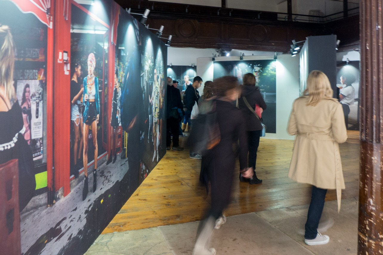
This show by Ewan Spencer, who graduated from the University of Brighton in 1997, was in the interesting space of a disused church in the centre of Brighton's Lanes. It is a celebration of youth and music culture in the UK and from around the world. His work is used in both the magazine and music industries and has been published in books. The images in this exhibition were taken along the route of the Notting Hill Carnival and in Liverpool. Instead of a gallery display of images this installation recreates the way in which photography is often encountered in a modern city with large format images posted onto custom built billboards. There is also a video and music presentation. Lighting is designed to look like streetlights. The viewer is directed round a route through the billboards in the way we might walk through narrow streets. I thought it worked well, although fellow students suggested I was showing my age when I had soon had enough of the music (?). The way the work was presented reminded me of the way Paul Gaffney had displays his images of walking and was something I have in mind when it comes to exhibiting my own work.


The Regency House.
We had a fairish walk in the rain to reach this location, but it was worth it for the location alone; I could have brought the doors home with me. There were three separate exhibitions here; two on the ground floor and one upstairs.
- DIY Dreams, Tom Heatley.


- Architecture is the Art for the Ages, David Sterry

- Selected Works, Sam Laughlin
The black and white images were stuck straight onto the wall. I was intrigued by this work with it's depiction of natural forms. Sam says that he used basic film techniques and old equipment, one lens even having mould growing in it. He bought all of the boards and lighting and installed and curated the work himself. The one aspect I was not so sure about was that he had gone for a low contrast approach.
The nest images were all of the same species (reed warbler I suspect?) and all the same basic structure, yet all different in a similar way to Bernd and Hilla Becher's work.
My main reflection is that there was an awful lot to take in here and I wonder if it would have been more punchy with less work. Sometimes less is more.


Day 2 began with a group crit. which I have written about elsewhere. After lunch we moved onto an exhibition in the Photofringe at the Phoenix Gallery where we saw the work of Dana Ariel.
Encountering Perforated Ground, Dana Ariel
This is a series of landscapes taken in Israel and Palestine that have been hand printed by Ariel herself. There was a mix of formats, some having white frames and printed on semigloss. These had a white border, but were not mounted. The frames were shallow box frames. Two very large vertical format images were printed on a very thin paper or tissue and hung simply from pins/magnets. There was one very large panorama that had been printed on either aluminium or PVC. There were no captions to these images which allows the viewer to form their own opinion and ideas as to the narrative, but there was also a slide show of text for the viewer to gain more information should they choose. Most images were in colour, but there were one or two in black and white.
Ariel says that they were taken between 2014 -2016 and tell a story of political erasure and displacement. She had repeatedly visited two villages on the border between Israel and Jordan and, although the villages do not appear in the photographs, the images are of the journey to get there. I was struck that like my work they featured paths and tracks. The land here is of edgelands, perforated ground and disputed territory.


An excellent, stimulating, if tiring, weekend. I had much to ponder on on the train journey home.
You were obviously further back than me and could get a picture of each of the images and the names of the authors - I missed some but could hear everything.
ReplyDelete