Tuesday, 7 February 2017

John Gossage: The Pond

When I shared my BOW with my peer led hangout group last week, one of my colleagues suggested that I look at John Gossage's work, The Pond.


Wikipedia tells us that John Gossage is an American photographer who is renowned for his artists books and uses his photographs to explore parts of the urban environment that are under-recognised such as abandoned tracts of land, debris, refuse and graffiti - edgelands to use current terminology.  Aperture website tells us that The Pond was groundbreaking when it was first published in 1985.  Today its subject matter would be commonplace.  It comprises images of a pond situated in a scruffy piece of edgelands woodland, a foil to Thoreau's Walden (Aperture 2017).  Rather than grand landscape in the tradition of Ansel Adams, we are told, instead, they reveal reality on the border between nature and humankind - (nature and culture?).  Robert Adams describes the work as believable because it reveals the darker side of man while it also demonstrates Gossage's passion for what remains of nature (Adams, 2013).  Adam's describes the book as a work of irony which focuses on the ugliness of man's despoliation of the environment, but  Americans at the time do not yet appreciate what they have done (Adams, 2013).  The same criticism could be levelled at many in this country.
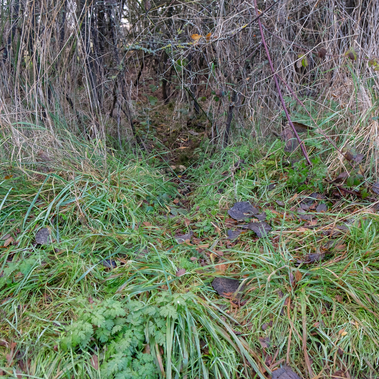
Gossage's work is very different to my own with a different purpose but it does portray a walk around a piece of woodland (containing a pond).  I have, at times, in my current BOW turned my camera on man's carelessness on my journeys through woodland, but that is not currently my theme.  Gossage's work is also in monochrome whereas mine is in colour.  The book is unusual for its time in that it contains no image on the cover, merely the title.  Despite the differences in work there are images of paths through his wood that are similar to ones I have taken and I think in particular of one very narrow path leading into the distance which is also similar to one of Richard Long's.  A couple of paths disappearing into vegetation would also work in my current work.  The book is arranged so that there is an image on the right hand page with a blank page on the left.  There are no captions.


Adams, R. (2013) Robert Adams on John Gossage's 'The Pond' [online] ASX. Available from: http://www.americansuburbx.com/2013/02/john-gossage-john-gossages-the-pond-1986.html [Accessed 07/02/17]
Aperture (2017) John Gossage - The Pond [online] Aperture. Available from: http://aperture.org/shop/john-gossage-the-pond-book/ [Accessed 07/02/17]
Wikipedia (2016) John Gossage [online] Wikipedia. Available from: https://en.wikipedia.org/wiki/John_Gossage [Accessed 07.02.17]

Monday, 6 February 2017

Footpaths and Memory

Intrigued by the idea of the landscape and memories I have experimented with the following images. I was prompted to blog them when one of my peer to peer hangout group suggested that he saw my footpath images " as traces, evidence of footsteps, memories of human purpose; perhaps just memories."  He felt that the wide open glades make a sense of human presence manifest, we know that many thousands of people have walked here before.  However, the paths become more and more faint until "perhaps the brush of grass is sent one way and not the other and this is a palimpsest; a trace of a path, a memory."
These comments reminded me of the images below that I had made before the hangout when I had been thinking along the lines of landscape and memory.  I have often reflected that we have memories of our walks and wanted to record this idea in single images.  To do this I took one image and then walked on, stopped and took another image looking along the path and repeated this up to five times.  Then, in photoshop I layered these images over one another in much the same way as memories are layers of our past experiences.  In the first of the to images below the constituent shots are straight photographs; in the second pair I moved the camera slightly on exposure to give a more abstract feel.  Perhaps these images can be thought of as photographic palimpsests.  At the moment these are just experiments as I am not sure that they fit with the main series of images in my work.  It is tempting to continue trying new ideas, but at this stage in my BOW I feel that I need to consolidate rather than keep making new images.  Still I shall keep this idea in mind for future work.  Perhaps I could continue to work on the idea during SYP with the idea of an extra series of images for a final exhibition or book.


The Road Not Taken; Robert Frost


During our Peer to Peer Hangout last week when my work was being shared, one member suggested I look at Robert Frost's Poem The Road Not Taken which I include below.

The Road Not Taken


Two roads diverged in a yellow wood,
And sorry I could not travel both
And be one traveler, long I stood
And looked down one as far as I could
To where it bent in the undergrowth;

Then took the other, as just as fair,
And having perhaps the better claim,
Because it was grassy and wanted wear;
Though as for that the passing there
Had worn them really about the same,

And both that morning equally lay
In leaves no step had trodden black.
Oh, I kept the first for another day!
Yet knowing how way leads on to way,
I doubted if I should ever come back.

I shall be telling this with a sigh
Somewhere ages and ages hence:
Two roads diverged in a wood, and I—
I took the one less traveled by,
And that has made all the difference.

This poem really resonated with me, reminding me of ideas that I had already included in my introductory text. On researching a commentary about the poem I discovered that it can be read on two levels. It can be read as a commentary on life and decision making, but, in fact, it was written as a joke for Frost's friend, poet, walker and naturalist Edward Thomas. When they went walking together Frost found Thomas chronically indecisive about which path they should choose and in retrospect often regretted the choice they had made.  Robert MacFarlane describes Edward Thomas as a 'foot philosopher' MacFarlane, 2016, p238).  In the Old Ways MacFarlane describes Thomas as a confident, solitary walker and that his poems are 'thronged with ghosts, dark doubles and deep forests in whch paths peter out....' (MacFarlane, 2013, p25).  This fits well with the idea of my images teasing the viewer: paths appear to go through a hole, but the paper is flat, 2D; how faint can a path be and still be a path, when is a path not a path because it is an animal track.  It also fits with the idea of paths being a metaphor for life or for memory.

MacFarlane, R. (2016) Landmarks. London: Penguin
MacFarlane, R. (2013) The Old Ways. London: Penguin
Robinson, K. (2016)Robert Frost: "The Road Not Taken" [online] Available from: https://www.poetryfoundation.org/resources/learning/core-poems/detail/44272#guide [Accessed 06.02.17]

Friday, 3 February 2017

BOW feedback from Peer to Peer Hangout

Since our peer group last saw my work in a hangout last Autumn:-

  1.  I had edited it for the Brighton weekend and produced a set of prints
  2. Made another edit following Brighton and submitted the work for Assignment 4
  3. Feedback from Assignment 4 was generally positive and encouraging and the main points were
  • Possibly too many ideas in the text;
  • possibly separate the then two series;
  • Don't shoot more indefinite paths, but rather use the most extreme shots as a starting point for the next exploration;
  • I had already been making more work on these lines and these images became series 3.
So now there are three series which I have experimented separating using the text which has been edited slightly but not dramatically.

The main points from my peers in the feedback were:-
  • The images are showing real progression over the months and are now starting to look coherent;
  • Overall the aesthetic is strong and it is a cogent piece of work;
  • The work is interesting, thought-provoking and sufficiently open (subject to some comments below)
  • Too many images with some repetition;
  • The three sets of images are distinctly different;
  • Text concise, about the right length and well structured, but perhaps it would be better to separate the text from the images and let the viewer decide which images /text belong to which set;
  • Also it is about the woods which is an extremely immersive environment.  The text coming and going between the sets keeps the viewer from disappearing mentally into the woods;
  • One member felt that it would be better if the text were not too directional;
  • Perhaps experiment and see how it feels if I start with the text and then mix the three sets of images, trying to reproduce the experience of the wood, where some paths lead somewhere and others nowhere;
  • Might it possibly be a good idea to drop the direct references to 'walking' and 'walker' after they have been mentioned in the opening (although odd given the emphasis on walking).  Perhaps this would open it out and encourage the viewer to think beyond the actual act of walking.  Might there even be a reference to the 'unconscious .....the imaginary' state;
  • A second member was less keen on the categorisation (three sets) and certainly would bring all the text together and make it more oblique, less clearly defined;
  • Perhaps retain the reference to the different ideas in the opening statement, then edit the series into a sequence that leaves the viewer more space to form their own view - less directive;
  • One member in particular liked the square format as it projects the work away from the landscape format;
  • The same member felt that there was nothing to be gained from an episodic character as it doesn't add anything to the work and it would be better for the viewer to be able to investigate it themselves;
  • Again the image-making is essentially done; it is now about editing and sequencing;
  • Without the text in between there would be a greater narrative sense; allow the viewer to decide the episodes;
  • One member referred to the idea of palimpsest.  Need to follow this up???;
  • Yet another member differed in opinion on the three sets saying that they worked, but still better to have one block of text;
  • Could there be some reference to 'time';
  • Some felt that the work/pathways etc was a metaphor for life's journey.  Another member felt this wasn't important;
  • The last set is perhaps the most evocative;
  • It was suggested that I look at The Pond by John Gossage.  Although the work is different to mine, I might find it useful;
  • Again the journey of life was mentioned and the possibility of the resemblance of the series to music/dance: beginning middle end with the opening being the overture;
  • Another photographer to look at was Paradise by Thomas Struth;
  • It was felt by one that the blog type presentation didn't do the work justice and doesn't allow for a proper exploration of the images as they are very linear;
  • There is a great potential in this set of images for speaking figuratively, for using metaphor which is limited by a blog presentation;
  • Look at Karne Knorr's series Gentlemen;
  • Roland Barthe's anchor and relay idea was referred to - the text at the moment is acting as an anchor that is anchoring interpretation in the literal.  With a little experimentation it it might be possible to find that point where text and image work together to create a meaning that goes beyond the literal;
  • This same member had looked at the video that I presented as part of Assignment 4 where I had added sound to the images and it was thought that the sound did this (the above), it enabled the viewer to see the series as a commentary on life rather than just a series of images about a local wood.
  • Another member suggested I look at Robert Frost's poem The Road not Taken.  The title was familiar and when I looked up the poem I realised that I knew it.  I think that there is lots of potential here, but how to use it??
All in all this was a very successful peer feedback from 8 other OCA students; what a wonderful resource for us all.  I am very grateful that they have taken time to look at my work and comment.  I am encouraged and now have a wealth of ideas to work with.

Sunday, 29 January 2017

Assignment 5; Second Draft

Walking in Woods
Walking allows me to slow down and fully experience and appreciate the landscape through which I travel.  When walking in woodland, it is easy to lose and find oneself again, to reflect, meditate and to reconnect with the world.  Footpaths disappearing into the distance are seductive.  Woods can be places of mystery and paths often wind and twist, seeming to have no purpose except to be followed. 

The horizon is limited and paths sometimes disappear round corners or into a hole in the vegetation leaving the walker to speculate on where they might lead.

1
2
3
4
5
6
At other times paths may be indefinite and ephemeral; so faint as to be nearly not paths.
7
8
9
10
11
12
13
14
15
16
17
Some paths are not as they seem.  At first they may appear to be a path, but when followed they lead to where no human would go.
18
19
20
21
22
23

Friday, 27 January 2017

The Hepworth Prize for Sculpture. The Hepworth, Wakefield

It is always a pleasure to visit and support The Hepworth in Wakefield so it was with anticipation that my wife and I decided to go to the 'Prize for Sculpture Exhibition.

The Hepworth launched this award to celebrate its 5th year.  It awards significant contributions to the development of contemporary sculpture by British or UK based artists at any stage in their career.  The inaugural shortlisted artists are Phylida Barlow, Steven Claydon, Helen Marten and David Medalla.  Each of the four has created an exhibition featuring new and recent work and each person's work had a gallery to itself.

David Medalla

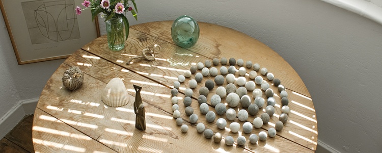
David Medalla's work is inspired by places and people and is informed by complex combinations of memories and evolving relationships, and often reflects rhythms and systems found in the natural world.  He uses a wide varity of media including painting, textiles, participatory work, performance and kinetic sculpture.  Two of my favourite pieces in this exhibition were in this category: Cloud Canyons 1964-2016 and Sand Machine, Bahagari, 1963-2016
Cloud Canyons is made of wood, acrylic, an electric engine, water and soap.  I a reservoir at the base of the sculpture the engine produces foam from the soap and water.  As it is made it expands up the transparent plastic tubes and above their mouths, surface tension(?) keeping the column together for some time without support.  As the column pf suds protrudes higher above the tubes it wafts and sways around in the slightest breeze.  What it was supposed to represent I am not sure, but I enjoyed it and found it fun, which was, perhaps, its only purpose.  It was certainly engaging.


Sand Machine (above) was made using sand, shell, necklace, bamboo, wood, wire, motor and electric wiring.  As the motor rotated the sculpture the wires at the bottom made perfectly circular patterns in the sand at the bottom.  Again great fun and reminded me somewhat of the sand patterns made with pendulums that  I used to get pupils to experiment with.  Abstract art driven by scientific principles.

Phyllida Barlow Untitled Screestage (2013)


This piece is huge and filled the room.  It is made of metal, wood, and concrete.  What it was supposed to represent, again I am not sure, but as with David Madella a lot of fun.  Although visitors were asked not to touch it was so substantial it can't possibly have mattered and we were encouraged to walk around and under it.  It reminded me of a sloping viewing platform such as in a cinema or auditorium or a gladiatorial amphitheatre.  I a totally different direction it could also represent a building collapsed in the aftermath of an earthquake.

Helen Marten 
 Helen Marten is interested in how people build relarionships to objects.  She references our coding of the visual world through her scuptures which are constructed like language.  Much the same way as photographs can be read like a language.  In her work the relationship between each element is as important and considered as the things themselves.  Materials used include wood, ceramic, metal, leather, plastic and fabric.  It was fascinating to go around each of these sculptures several times noticing yet more with each observation - even a broken eggshell!!


 Steven Claydon
His sculptures comprise old, new, natural, man-made, modern and traditional objects.  They refer to archaeology, anthropology, and historical artefacts.  He references the past - whether twentieth century Modernism or primordial history - and science fiction.  In this exhibition Claydon has engaged with the architecture of the gallery to present a series of sculptures and site-specific works that activate the space around them.  Solid materials are often not what they seem and light, smell and sound are also employed.


 Anthea Hamilton and Kettle's Yard
As well as the sculpture prize exhibition I was fascinated by the two galleries devoted to Kettle's Yard.Kettle's Yard is a series of cottages converted into a Modernist home by collector Jim Ede.  The Cambridge gallery is currently closed for renovation and key items of the collection temporarily hosed at the Hepworth.  That itself would have been interesting and fascinating enough, but 2016 Turner Prize nominee Anthea Turner, renowned for her art-pop, culture inspired sculptures and installations has produced an installation entitled Reimagining Kettles Yard.  The exhibition comprises original works from Kettle's Yard along with Turner's own work inspired by the Cambridge collection.

I was enthralled by this exhibition, perhaps because Ede transformed his home by using Modernistart works juxtaposed alongside natural objects - something we endeavour to do in our own home, although we do not own any art works of such value; perhaps one day.

Further Trials With Printing BOW Images

Having received some more matte paper: Permajet Matte Plus, I have carried out some more test prints.  This time increasing the sharpness slightly in the Lightroom print module from low to standard as I did with the Oyster paper.  As with the Oyster the images are certainly crisper with the Matte Plus and have more clarity than the original Classic Fine Art Portrait paper that I used.  This may be that I have increased the sharpness slightly, but the Portrait paper has a slight texture to it, whereas the the Matte Plus is perfectly smooth.  The Fine Art Portrait paper is also very slightly off white compared to the other two and this may have an influence.  My one reservation with the Matte Plus is that it is a tad lighter weight than I would like for assessment and if the decision is to go with a matte paper I will order some of the more expensive FB Matt paper.  If the decision is to go with the Oyster/Lustre paper I am tempted to try another paper such as the Smooth Pearl first.  I am familiar with the Permajet range of papers and have their complete range of ICC profiles to use with my Epson PhotoR2880 printer.